COLOR THEORY
PROPERTIES OF COLOR AND COLOR SCHEMES:
COLOR: Color is present when light strikes an object and it is reflected back into the eye, a reaction to a hue arising in the optic nerve.
PROPERTIES OF COLOR:
HUE: The distinguishable color, like red, blue or yellow.
VALUE: lightness or darkness of the hue.
SATURATION (also called INTENSITY or CHROMA): brightness or dullness of the hue.
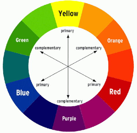
COLOR WHEEL: A circular chart showing color relations.
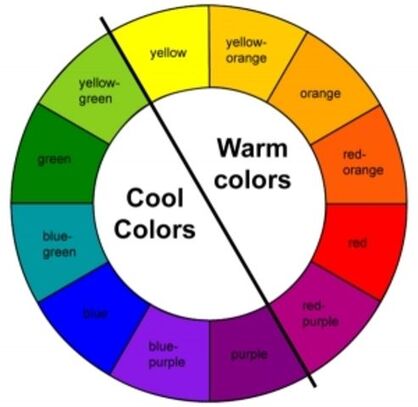
WARM COLORS: Considered exciting; what you see in fire: red, orange, yellow.
COOL COLORS: Considered calming, what you see in water: blue, green, violet.
PRIMARY COLORS: Colors that can’t be made by mixing (Red, Yellow, Blue).
SECONDARY COLORS: Colors made by mixing two primary colors (Orange, Green, Violet)
TERTIARY COLORS: Colors made by mixing a primary with a secondary color. (Red-orange, Blue-green, Yellow-orange, and so on.)
NEUTRAL COLORS: Colors that appear more brown or gray.
COLOR HARMONY: The impression that colors go together and are harmonious in a picture.
COLOR HARMONY TIP: Use any primary/secondary colors from your color scheme to mix your neutral colors (grays and browns).
COLOR SCHEMES: Combinations of color that are specifically chosen to create color harmony in a picture.
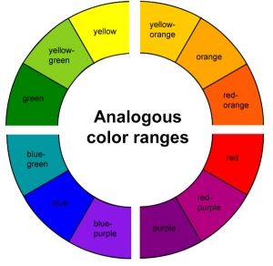
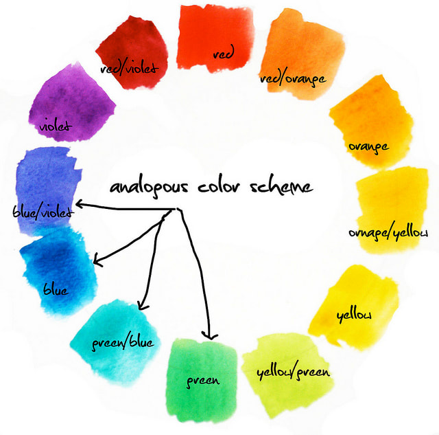
ANALOGOUS COLORS: Next to each other on the color wheel, considered calm and peaceful
COMPLEMENTARY COLORS: Are opposite one another on the color wheel. When mixed with one another they dull one another. When used in a color scheme next to one another, are considered bold and graphic.
COLOR: Color is present when light strikes an object and it is reflected back into the eye, a reaction to a hue arising in the optic nerve.
PROPERTIES OF COLOR:
HUE: The distinguishable color, like red, blue or yellow.
VALUE: lightness or darkness of the hue.
SATURATION (also called INTENSITY or CHROMA): brightness or dullness of the hue.
COLOR WHEEL: A circular chart showing color relations.
WARM COLORS: Considered exciting; what you see in fire: red, orange, yellow.
COOL COLORS: Considered calming, what you see in water: blue, green, violet.
PRIMARY COLORS: Colors that can’t be made by mixing (Red, Yellow, Blue).
SECONDARY COLORS: Colors made by mixing two primary colors (Orange, Green, Violet)
TERTIARY COLORS: Colors made by mixing a primary with a secondary color. (Red-orange, Blue-green, Yellow-orange, and so on.)
NEUTRAL COLORS: Colors that appear more brown or gray.
COLOR HARMONY: The impression that colors go together and are harmonious in a picture.
COLOR HARMONY TIP: Use any primary/secondary colors from your color scheme to mix your neutral colors (grays and browns).
COLOR SCHEMES: Combinations of color that are specifically chosen to create color harmony in a picture.
ANALOGOUS COLORS: Next to each other on the color wheel, considered calm and peaceful
COMPLEMENTARY COLORS: Are opposite one another on the color wheel. When mixed with one another they dull one another. When used in a color scheme next to one another, are considered bold and graphic.
ANALOGOUS COLORS - next to each other on the color wheel
|
|
COMPLEMENTARY COLORS - opposite each other on the color wheel
COLOR TEMPERATURE:
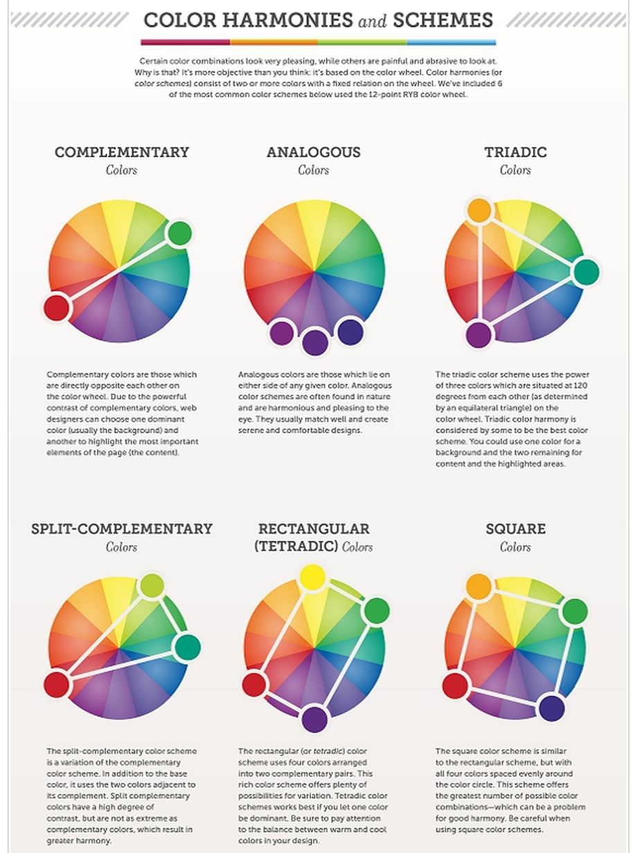
Think of each example above as a spinner that you can spin to select different colors than the ones shown, as long as they are spaced apart in the same way on the wheel. For example, another Triadic scheme would yellow, blue and red.
An additional color scheme is ALTERNATE, or every other color on the wheel (example: blue, green, yellow).
YOU CAN ALSO MAKE COLOR SCHEMES WITH WARM/COOL:
WARM WITH COOL ACCENTS is mostly warm colors, with a few small things in cool colors that you want to stand out.
COOL WITH WARM ACCENTS is mostly cool colors, then a very few things in warm that you want to stand out, or 'accent.'
