COMPOSITION
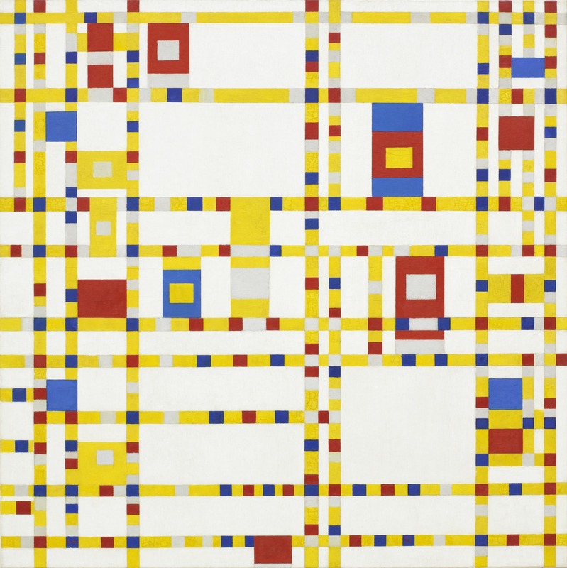
Piet Mondrian, Broadway Boogie Woogie, oil on canvas, 1943
PRINCIPLES OF DESIGN:
PATTERN, BALANCE, CONTRAST, EMPHASIS A PATTERN is made up of repeated lines, shapes and colors. The pattern above has repeated squares and rectangles made with primary colors, also creating a sense of repetition. BALANCE is acheived in an artwork when visual weight is spread evenly around the picture. This picture above has symmetrical balance, because (nearly) half of the picture is arranged in a way that mirrors the opposite half. A picture can also have asymmetrical balance, where the visual weight is equal but each side is arranged differently. EMPHASIS, or a focal point, is a place of interest where the artist directs your eye. In the picture above, slightly off-center, you can see a single rectangle that is yellow inside red inside blue, larger and bolder than any other rectangle, which is the focal point of the picture. Here the artist is also using a framing strategy that adds emphasis. CONTRAST is achieved when something stands out against something else, usually by being the opposite: dark/light, dull/bright, In this picture, the yellow lines stand out as darker against the surrounding white, and the blue and red squares stand out as darker against the lighter yellow. Notice that all of the squares in the picture are arranged on a grid in lines that are parallel or perpendicular. This creates a sense of alignment. The grid of lines helps lead your eye to the focal point, also acting as a leading line. |
COMPOSITION:
Composition refers to how elements are of an artwork are organized on a page. In art, the composition of a work of art often has more impact on a viewer than what is included in the picture. Something be drawn beautifully can be lost on a viewer if it is placed in a composition that is not strong. Composition is sometimes viewed as the most important aspect of good design. COMPOSITION STRATEGIES: FILLING THE PAGE: avoiding large areas of uninterrupted space. Bordering: Creating a border around the work with equal width on the top and sides, and the same or slightly more width at the bottom. Positive and Negative Space: Making both positive and negative space have interesting shapes. Alignment: Lining up text or visuals on the same line. Text can be aligned to the middle, left, or the right side of a margin. Repetition and Pattern: Repeated lines, shapes or colors that create patterns. Hierarchy: Directing the viewer where to look first, second and third by using varying degrees of contrast or emphasis. Gridding: Organizing parts of the picture on a rulered grid of boxes or other shapes. Rule of Thirds: Dividing the page into 3 equal parts across and down, then putting the focal point on a crossing point of these lines meet (see photo video). Focal point slightly off-center: Putting the most important thing just slightly ofw-center from the middle of the page. Framing: Situating something important inside a framing device, such as a vase in front of the rectangular frame of a window. Proximity: Grouping things together in a visual group that are meant to be understood as a group; seperating things meant to be understood separately. |
THE TWO VIDEOS BELOW demonstrate strong design and composition strategies.
You will be expected to apply these techniques to your artwork assignments.
You will be expected to apply these techniques to your artwork assignments.
|
|
|
|
|
|
