COVER ASSIGNMENT
Create a Cover Design for your Sketchbook Cover in the style of a Graphic Novel
|
|
|
|
INTRODUCTION: LEARN HOW TO MAKE A STRONG COMPOSITION
Composition refers to how something is arranged on a page.
Strong composition is essential for a strong design.
TO DO:
Start a new page in your sketchbook titled COMPOSITION.
Watch the videos below and take any notes that you think will help you remember.
You will need this information to design your cover.
You may be quizzed on the topic later in the grading period.
|
|
|
GRAPHIC NOVEL COVER ASSIGNMENT
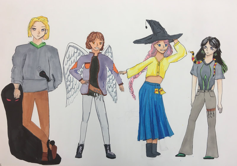
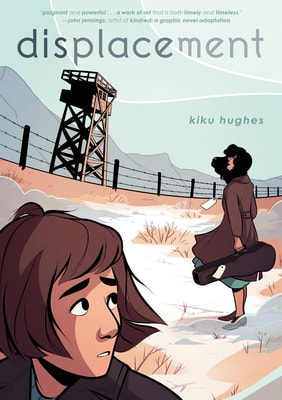
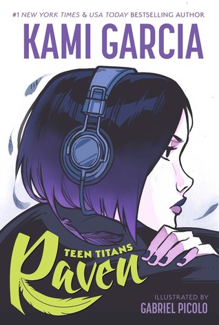
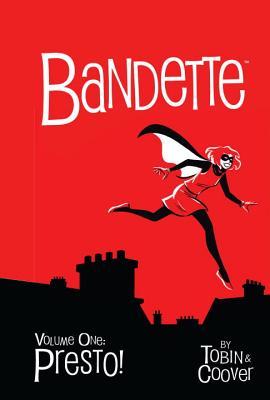
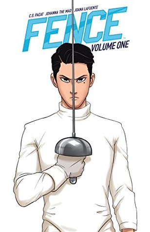
Examples of final student work
|

|
ASSIGNMENT REQUIREMENTS:
SKETCHBOOK COVER:
Design a strong cover composition for your sketchbook, DO NOT design it on the cover.
Start with thumbnail sketches inside your sketchbook (explained below) and then detailed sketch, then get approval to draw the final on the cover.
Materials: Sketchbook, Pencil, and for the Final, your choice of Colored Pencils, Felt-tip pen / value pen, and/or Markers
CONTENT REQUIREMENTS:
Must include:
-Your FIRST and LAST NAME, the word ANIMATION, the PERIOD and the YEAR in legible, stylized lettering
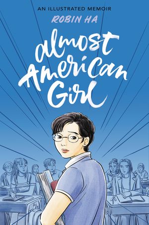
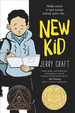
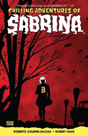
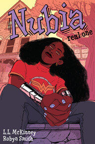
-A DRAWING taking up at least 1/3 of the page that shows an interesting character, in the style of a graphic novel cover, that somehow connects to who you are, your style, or what matters to you. Have a look at the covers on this page for inspiration, or google search 'graphic novel cover.' The ones on this page are from young adult graphic novels and were chosen for their simple, bold graphic design with lettering, character, and environment.
DESIGN REQUIREMENTS:
YOUR FIRST AND LAST NAME MUST BE A PROMINENT PART OF THE DESIGN (as well as the other text required above), not added as an after-thought later
CLEAN AND WELL-PLANNED: NO CROSSOUTS OR SCRIBBLES
NO LARGE AREAS OF WHITE SPACE
USE OF PRINCIPLES OF DESIGN, especially PATTERN, BALANCE, CONTRAST, EMPHASIS and ALIGNMENT
USE OF STRONG COMPOSITION DESIGN STRATEGIES (at least five)
AT LEAST THREE KINDS OF LETTER STYLES (fonts): one for your name, one for the word Animation, one for the period and year.
USE OF STRONG ELEMENTS OF ART: LINE, SHAPE, VALUE, FORM, SPACE (color, texture)
BORDER or SUGGESTED BORDER
SKETCHBOOK COVER:
Design a strong cover composition for your sketchbook, DO NOT design it on the cover.
Start with thumbnail sketches inside your sketchbook (explained below) and then detailed sketch, then get approval to draw the final on the cover.
Materials: Sketchbook, Pencil, and for the Final, your choice of Colored Pencils, Felt-tip pen / value pen, and/or Markers
CONTENT REQUIREMENTS:
Must include:
-Your FIRST and LAST NAME, the word ANIMATION, the PERIOD and the YEAR in legible, stylized lettering
-A DRAWING taking up at least 1/3 of the page that shows an interesting character, in the style of a graphic novel cover, that somehow connects to who you are, your style, or what matters to you. Have a look at the covers on this page for inspiration, or google search 'graphic novel cover.' The ones on this page are from young adult graphic novels and were chosen for their simple, bold graphic design with lettering, character, and environment.
DESIGN REQUIREMENTS:
YOUR FIRST AND LAST NAME MUST BE A PROMINENT PART OF THE DESIGN (as well as the other text required above), not added as an after-thought later
CLEAN AND WELL-PLANNED: NO CROSSOUTS OR SCRIBBLES
NO LARGE AREAS OF WHITE SPACE
USE OF PRINCIPLES OF DESIGN, especially PATTERN, BALANCE, CONTRAST, EMPHASIS and ALIGNMENT
USE OF STRONG COMPOSITION DESIGN STRATEGIES (at least five)
AT LEAST THREE KINDS OF LETTER STYLES (fonts): one for your name, one for the word Animation, one for the period and year.
USE OF STRONG ELEMENTS OF ART: LINE, SHAPE, VALUE, FORM, SPACE (color, texture)
BORDER or SUGGESTED BORDER
ASSIGNMENT STEPS:
PART 1 THUMBNAIL SKETCHES (at least 3): Artists usually start by 'thumbnailing' ideas, and you will do the same. Thumbnails are tiny versions of ideas you want to pursue. You try several different designs and then choose the one you like best.
On the next page of your sketchbook, create a small grid of three or four rectangles about 4 inches tall by 3 inches wide. Title the page 'thumbnails.' Inside the boxes, draw three or four different ideas for your cover. You may also wish to test out letter designs on a different page. Be sure to use the principles of design and composition strategies you learned in the introduction. The videos below can also help you with lettering ideas.
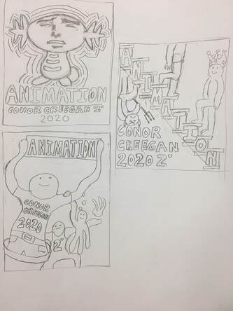
Thumbnail Examples of student work
|

|
PART 2: DETAIL SKETCH (not pictured here, but described)
- Choose which thumbnail you like best.
- Experiment with letter designs.
- In pencil, recreate the thumbnail in a 6 inch high x 4 inch wide rectangle. Then make a sketch inside of it in more detail, placing the pictures and letters in a pattern that works for you. Plan out where your text begins and ends and how will align (middle? left? right?). The how-to video below shows you how to design it all together, but the lettering style is pretty traditional, so the links on the right will show you more graphic novel-style fonts. Fill in some parts of your sketch with the final materials you wish to use (marker, coloured pencil, or black pen). You will want to have a value and/or color plan, and to integrate picture and text.
|
Watch the video above to see techniques for lettering.
|
PART 3: FINAL COVER: Once your design is approved, create it on the actual COVER of your sketchbook.*
Please note: You cannot get credit for part 3 without doing part 1 and 2 before you begin it; you also cannot get credit for doing part 1 and 2 if you do it after doing part 3.
Please note: You cannot get credit for part 3 without doing part 1 and 2 before you begin it; you also cannot get credit for doing part 1 and 2 if you do it after doing part 3.
- Using a very light pencil and a ruler, grid out the different areas where you are going to place each section on the cover of your journal. Do not line or shade anything in until you have mapped out all the parts and rulered where you want to put them in pencil.
- Very lightly sketch out the letters and where the picture will go.
- Very carefully and with focus, begin your final work in your final media/materials. It is best to plan uninterrupted time for this stage, phone off, 'focus' on. You can have your favourite music on if it helps you concentrate or get lost in what you are doing.

|

|
USEFUL COMPOSITION VOCABULARY:
|
COMPOSITION:
Composition refers to how elements are of an artwork are organized on a page. In art, the composition of a work of art often has more impact on a viewer than what is included in the picture. Something be drawn beautifully can be lost on a viewer if it is placed in a composition that is not strong. Composition is sometimes viewed as the most important aspect of good design COMPOSITION STRATEGIES: Alignment: Lining up text or visuals on the same line. Text and images can also be aligned to the middle, the left, or the right side of a margin. Repetition: Repeated lines, shapes or colors which create patterns and consistency Hierarchy: Directing the viewer where to look first, second and third by using varying degrees of contrast, or emphasis. Rule of Thirds: Dividing up the page into three equal parts across, three equal parts down, and putting the most important thing in your picture where these lines meet. Balanced Framing/Bordering: Creating a negative space border around the work with equal width on the top and sides, and slightly more width at the bottom. Strong use of positive and negative space: Bringing attention to both positive and negative space, and making both an interesting shape. Also FILLING THE PAGE: avoiding large areas of uninterrupted space. Proximity: Grouping things together in a visual group that are meant to be understood as a group; seperating things meant to be understood separately. |
PRINCIPLES OF DESIGN:
PATTERN, BALANCE, CONTRAST, EMPHASIS A PATTERN is made up of repeated lines, shapes and colors, sometimes with even spacing in between to create pleasing positive and negative space. There are many ways to achieve BALANCE in an artwork. Balance is acheived when visual weight is spread evenly around an artwork.A picture can have symmetrical balance, because (nearly) half of the picture is arranged in a way that mirrors the opposite half. A picture can also have asymmetrical balance, where the visual weight is equal but each side looks different. EMPHASIS, or a focal point, is a place of interest where the artist directs your eye. A design can be arranged on a grid in lines that are parallel or perpendicular. This creates a sense of alignment. The grid of lines can help lead the eye the focal point, which means it also acts as a leading line. CONTRAST is achieved when something stands out against something else, usually by being the opposite. For example, contrast shows up in dark against light, bright against dull. |
